
EUROTON
MOBILE APP EXCELENCE
In addition to the website – responsive, and all – we built out a mobile app for PayJunction. We used the Design System of the website to keep the app in line with the overall theme of PayJunction.
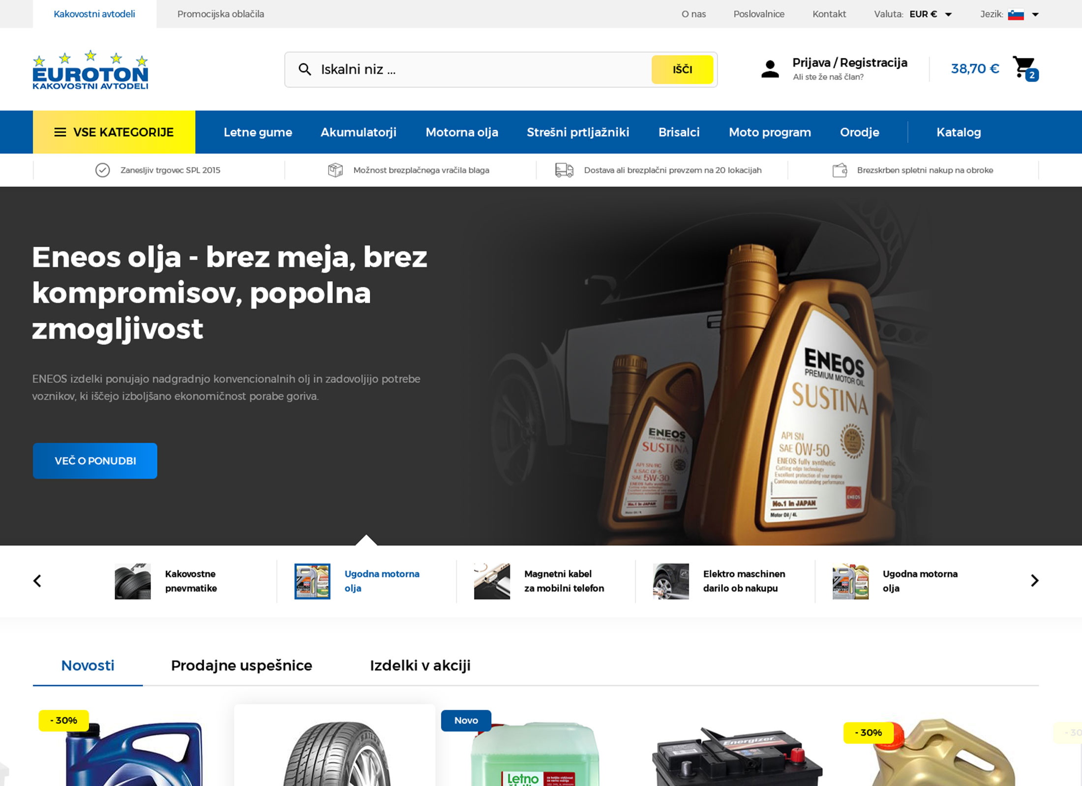
u003ch3u003eAN ONLINE STORE SPECIALIZING IN AUTOMOTIVE CAR SPARE PARTSu003c/h3u003ernWith an extensive catalog of products, they cater to a diverse audience seeking reliable and high-quality components for your vehicles.
EUROTON
Meet EUROTON, a prominent player in the automotive spare parts industry, committed to delivering quality products to car enthusiasts and professionals alike. Our collaboration with EUROTON aimed to enhance their online presence, focusing on creating a cutting-edge e-commerce platform that elevates the shopping experience for their customers.
u003cstrongu003eEnhanced User Experience (UX):u003c/strongu003e Develop a seamless and intuitive UX that facilitates easy navigation for customers seeking specific automotive spare parts.rnClean and Unique Design: Create a visually appealing and unique UI design that aligns with EUROTON’s brand identity and sets them apart in the competitive market.rnOptimized Product Showcase: Implement a user-centric approach to present products effectively, providing detailed information and facilitating quick decision-making.rnMobile Responsiveness: Ensure the website is fully responsive to provide a consistent and optimized experience across various devices.rnSales Boost: Aim for a significant increase in online sales by improving user engagement and creating a compelling shopping environment.rn
The groundwork on which everything is built: the brand. We began by drawing out a lot of rough ideas, and used those to narrow down to a concept that is best suited for the vision of the company.
We were tasked to keep the users focus on their exercises. This challenge drive us to come up with relaxing color variations, smooth animations, and combine it with carefully curated fonts.
The groundwork on which everything is built: the brand. We began by drawing out a lot of rough ideas, and used those to narrow down to a concept that is best suited for the vision of the company.


In addition to the website – responsive, and all – we built out a mobile app for PayJunction. We used the Design System of the website to keep the app in line with the overall theme of PayJunction.


The groundwork on which everything is built: the brand. We began by drawing out a lot of rough ideas, and used those to narrow down to a concept that is best suited for the vision of the company.
In addition to the website – responsive, and all – we built out a mobile app for PayJunction. We used the Design System of the website to keep the app in line with the overall theme of PayJunction.

Our commitment to EUROTON doesn’t end with the website launch. We will continue to monitor performance, implement improvements, and explore additional strategies to further elevate EUROTON in the digital landscape.